Branding Case Study
Southern Emerald Cleaning & Painting
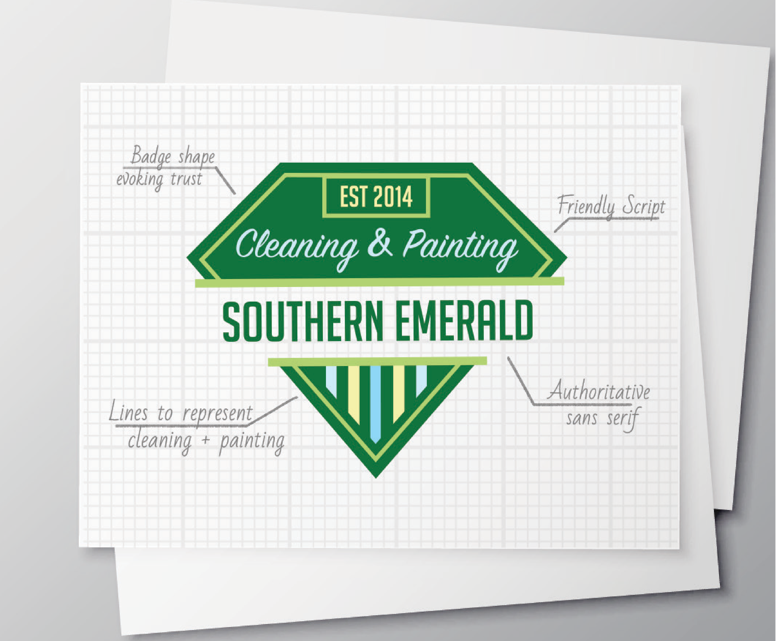
LOGO - The badge shape for the logo was inspired bu the business owner’s military background. Badges automatically inspire trust and give off an officail air. The shape of the badge is a typical jewel shape, to represent an emerald. The lines at the bottom represent the services offered: cleaning and painting.
TYPEFACES - The typeface used for “Southern Emerald” is a bold, authoritative sans serif. It has a slight military feel to it, which is also a nod to the owner’s military background. The words “Cleaning & Painting” are a more friendly scriot. This is a nice contrast to the sans serif, and makes the company seem more approachable for potential clients.
COLORS - A rich green was an obvious choice for a company called “Southern Emerald”. It is paired with a lighter lime green, a bright yellow, and a cool blue. In the logo, the vertical yellow lines represent painting, and the blue ones represent cleaning.