Tradeshow Design
Home Depot + HD Supply “Better Together”
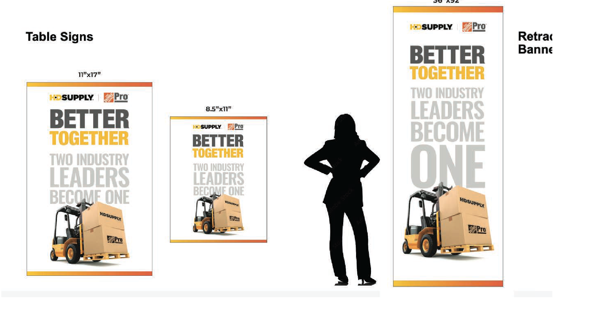
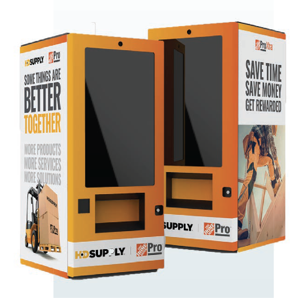
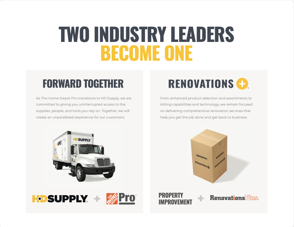
The Better Together tradeshow celebrated the merger of HD Supply and Home Depot Pro, bringing employees, customers, and vendor partners together under a unified brand experience. The event identity came to life through a comprehensive environmental design system spanning signage, digital screens, banners, vending machines, and more. As the heart of the visual language I created a bold gradient that blended Home Depot's iconic yellow with Home Depot Pro's signature orange, creating a powerful symbol of two brands becoming one.
Showcasing an expanded portfolio
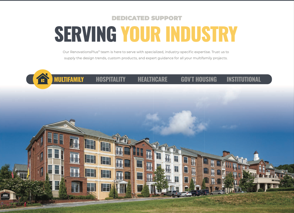
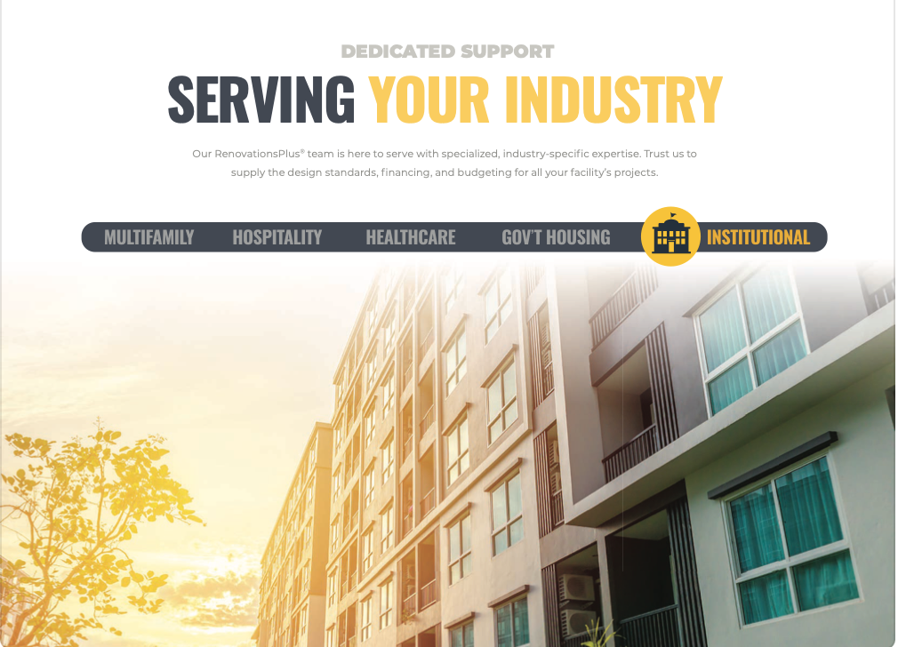
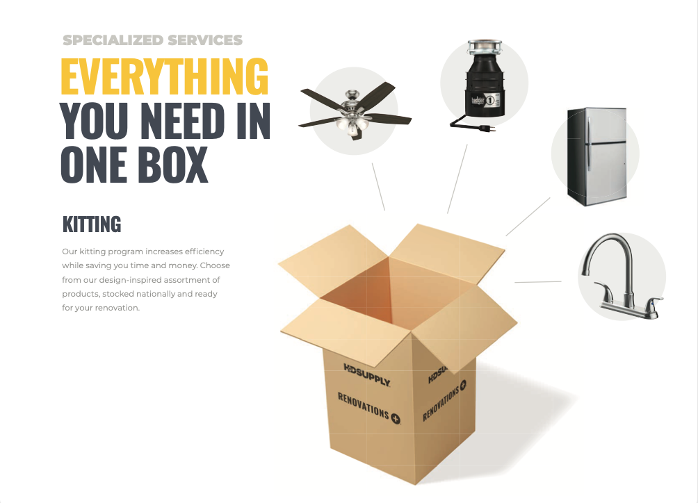
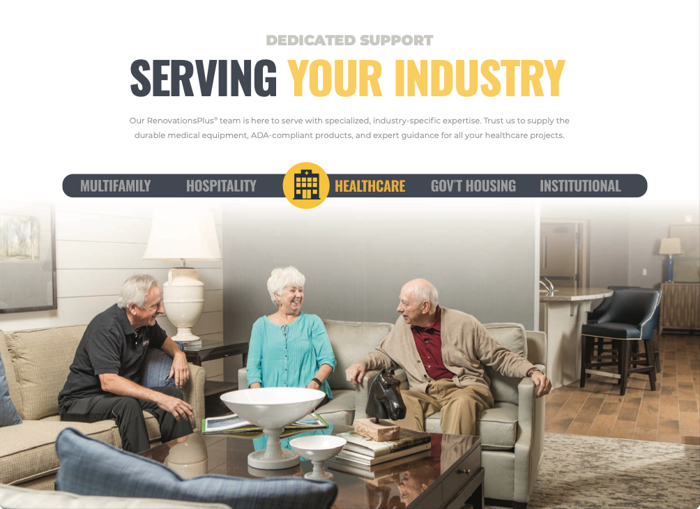
As the primary host of the event, HD Supply used the tradeshow to showcase the expanded products, services, and capabilities made possible through the merger. Interactive exhibits, product demonstrations, and educational sessions highlighted new offerings while introducing customers to a broader range of solutions and support resources available through the combined organization.
Hard to miss design
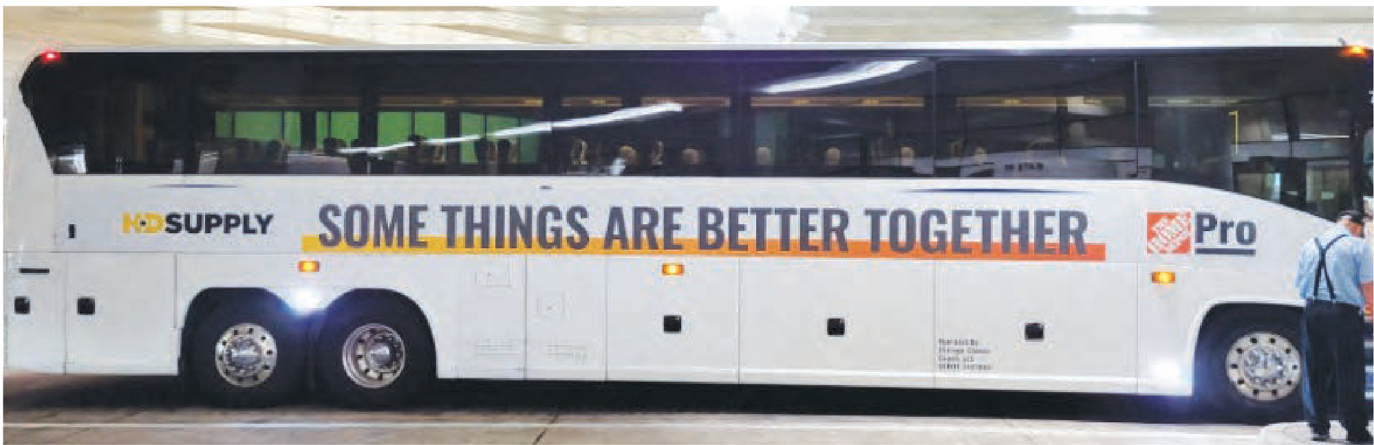
One of the event's most iconic features was a fleet of co-branded buses wrapped in the signature Better Together gradient. Transporting guests between the hotel and event venue, the buses served a practical purpose while also acting as a moving extension of the brand. Parked prominently outside the venue throughout the event, they became a highly visible symbol of the merger and one of the most memorable expressions of the Better Together story.