Mobile App UX Design
PlantPro
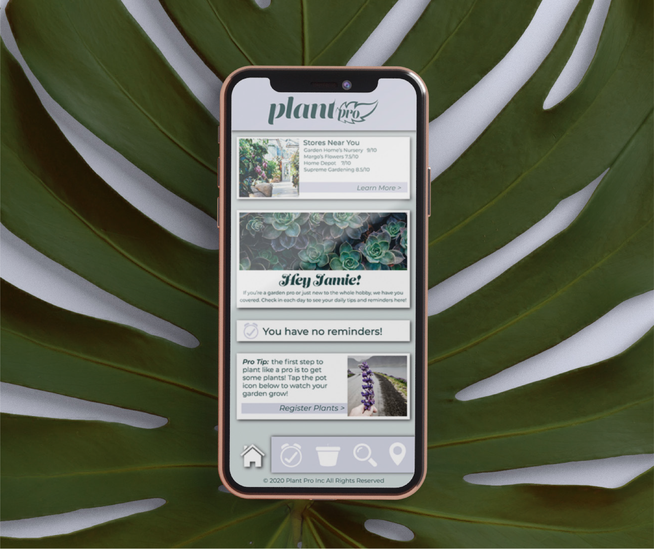
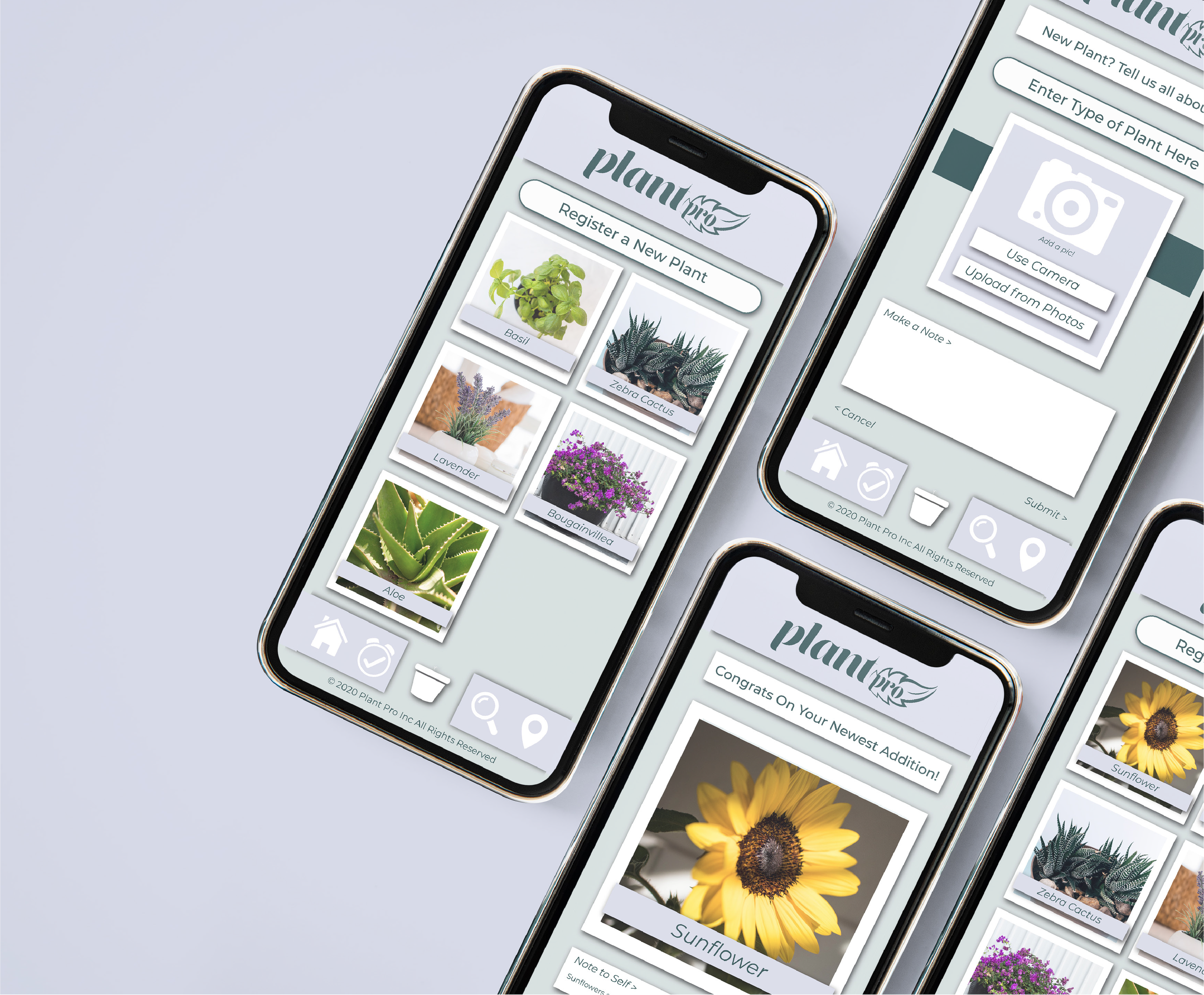
A gardening app for the busy millennial. PlantPro aims to be organized, aesthetically pleasing, and hassle free. It allows you to document a virtual garden, set necessary reminders, look up helpful tips and tricks, and locate nearby nurseries. It is the perfect gardening accessory.
The interface design was very inspired by the polaroid pictures trend. The gridded design makes everything appear functional, neat, and organized. Icons at the bottom of the screen allow for easy navigation throughout the app, no matter what screen you are on.
Target Audience
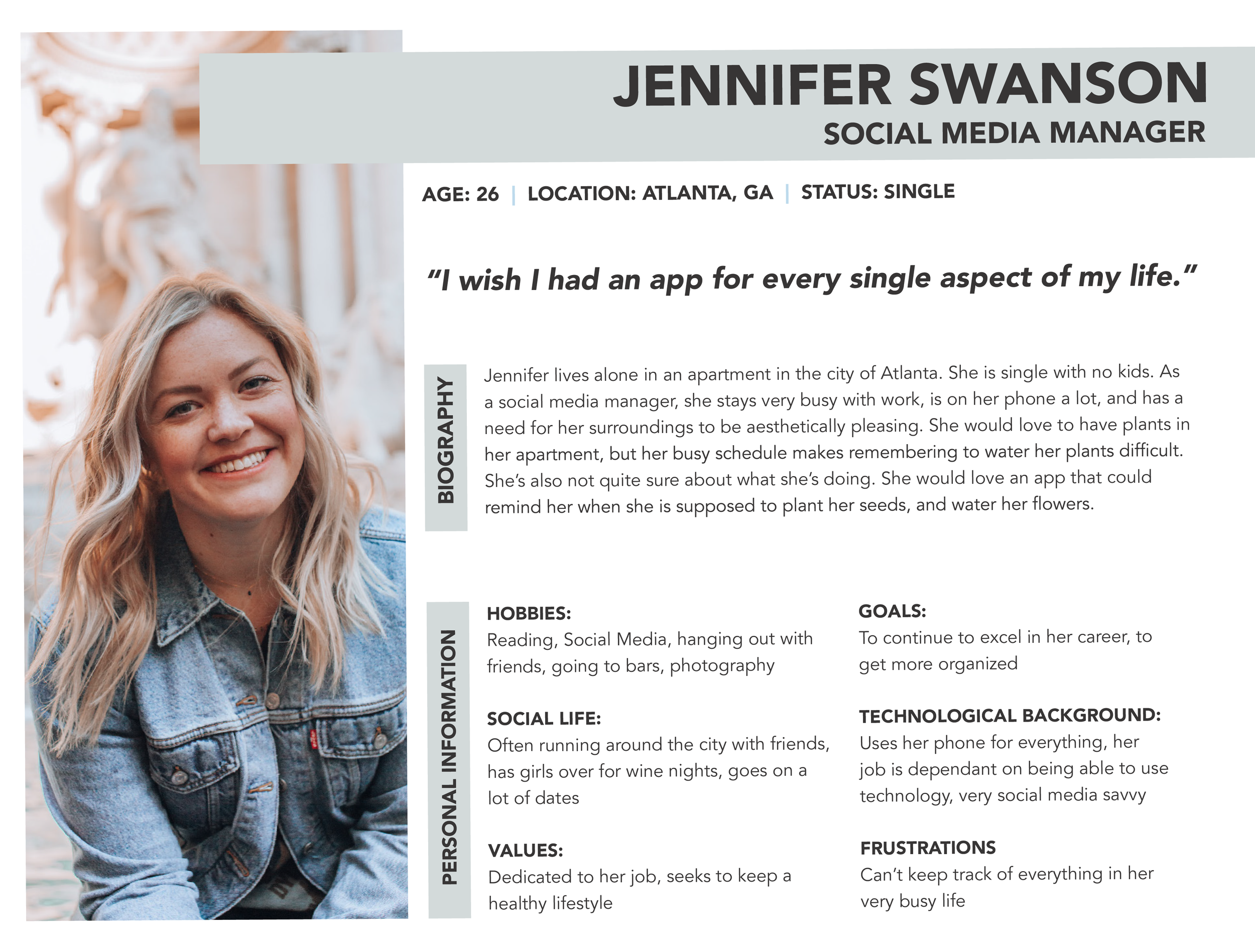
PlantPro’s target audience is the young, busy professional. Their app is designed for younger millennials, ages 25-35. They also typically target women. Their audience is the type of person who likes to be organized, but is sometimes too busy to accomplish it. They are extremely tech savvy, and depend on their phone for aid with most daily tasks.
Color Scheme
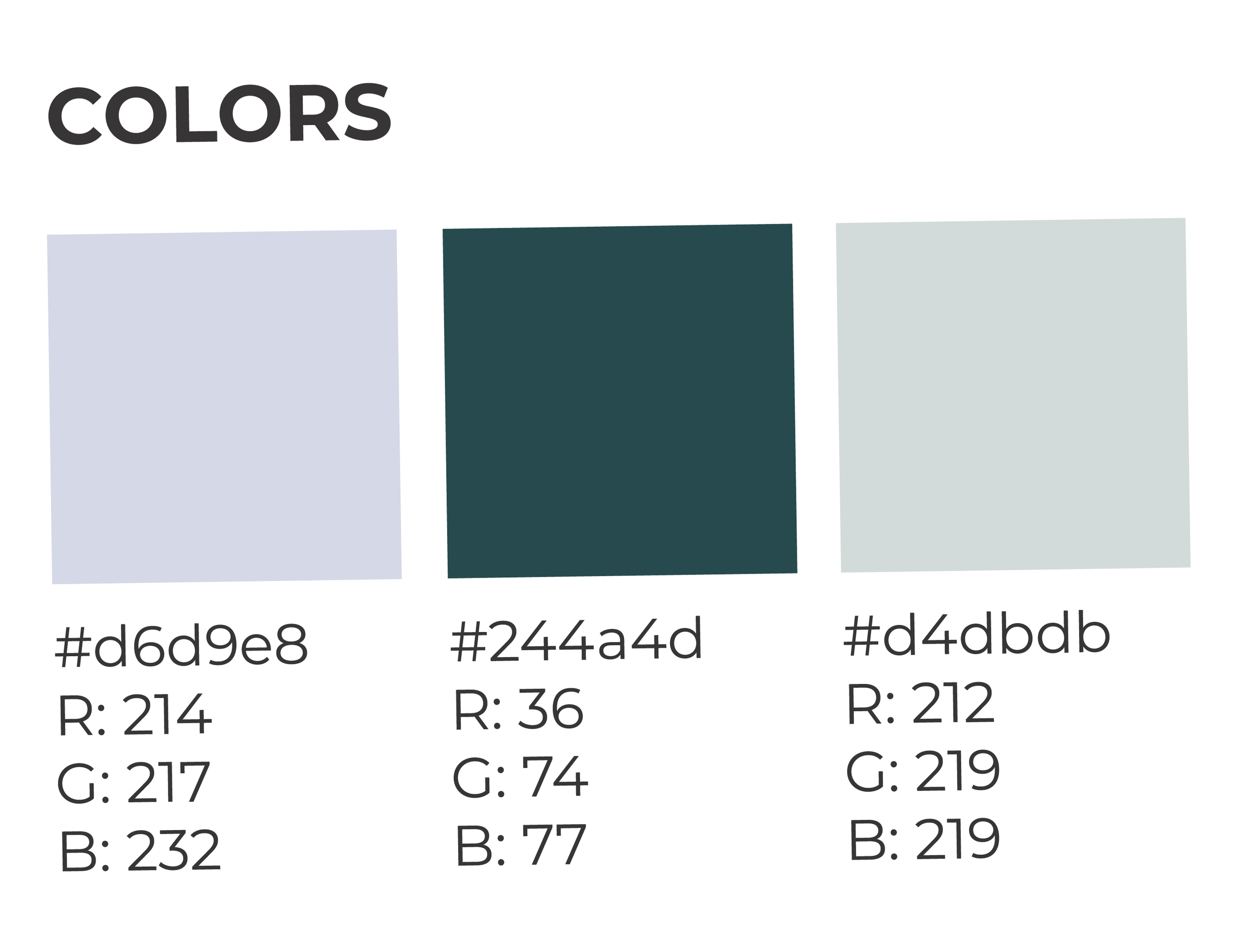
To set the app apart from other gardening apps, bright greens were set aside for a more muted, aesthetically pleasing color scheme consisting of a cool lavender, deep emerald green, and grayish green. This color scheme appeals to a more mature audience, and allows to pictures that the user uploads to stand out from the interface.